Data Science/데이터 시각화
Matplotlib 모듈로 그린 Chart에서 Text 사용하기
- -
2022년 2월 3일(목)부터 4일(금)까지 네이버 부스트캠프(boostcamp) AI Tech 강의를 들으면서 개인적으로 중요하다고 생각되거나 짚고 넘어가야 할 핵심 내용들만 간단하게 메모한 내용입니다. 틀리거나 설명이 부족한 내용이 있을 수 있으며, 이는 학습을 진행하면서 꾸준히 내용을 수정하거나 추가해 나갈 예정입니다.
Chart에서 Text 사용하기
Matplotlib에서 Text
시각화에서의 text라는 말이 어색할 수도 있지만, 그림만으로는 줄 수 없는 많은 설명을 추가해줄 수 있다.
잘못된 전달에서 생기는 오해를 방지할 수도 있다.
하지만 Text를 과하게 사용하면 오히려 이해를 방해할 수도 있다.
Figure에서의 Text 요소
- Ttile
- 가장 큰 주제를 설명한다.
- Label
- 축에 해당하는 데이터 정보를 제공한다.
- Tick Label
- 축에 눈금을 사용하여 스케일 정보를 추가한다.
- Legend
- 한 그래프에서 2개 이상의 서로 다른 데이터를 분류하기 위해서 사용하는 보조 정보이다.
- Annotation(Text)
- 그 외의 시각화에 대한 설명을 추가한다.
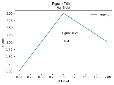
fig, ax = plt.subplots()

fig.suptitle('Figure Title')

ax.plot([1, 3, 2], label='legend')
ax.legend()

ax.set_title('Ax Title')
ax.set_xlabel('X Label')
ax.set_ylabel('Y Label')

ax.text(x=1,y=2, s='Text')
# fig 전체 위치에 대하여 x 위치는 0.5, y 위치는 0.6에 텍스트를 표싷나다.
fig.text(0.5, 0.6, s='Figure Text')

plt.show()
Text의 속성
웹 개발에서의 CSS와 비슷한 요소가 있다.
Font
family- serif, sans-serif 등
sizeorfontsize- medium, large 등
styleorfontstyle- normal, italic, oblique 등
weightorfontweight- normal, medium, bold 등
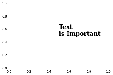
fig, ax = plt.subplots()
ax.set_xlim(0, 1)
ax.set_ylim(0, 1)

ax.text(x=0.5, y=0.5, s='Text\nis Important',
         fontsize=20,
         fontweight='bold',
         fontfamily='serif',
       )


plt.show()
Details
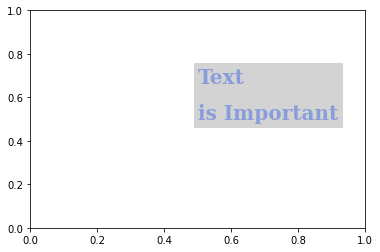
폰트 자체와는 조금 다르지만 커스텀할 수 있는 요소이다.
colorlinespacing: 자간backgroundcolor: 하이라이트 지정alpha: 투명도zorder: $z$축으로서의 순서- 맨 앞 또는 뒤로 보낼 수 있음
visible
fig, ax = plt.subplots()
ax.set_xlim(0, 1)
ax.set_ylim(0, 1)

ax.text(x=0.5, y=0.5, s='Text\nis Important',
        fontsize=20,
        fontweight='bold',
        fontfamily='serif',
         color='royalblue',
         linespacing=2,
         backgroundcolor='lightgray',
         alpha=0.5
       )


plt.show()
Alignment
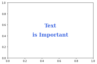
정렬과 관련하여 이런 요소들을 조정할 수 있다.
ha: horizontal alignmentva: vertical alignmentrotationmultialignment
fig, ax = plt.subplots()
ax.set_xlim(0, 1)
ax.set_ylim(0, 1)

ax.text(x=0.5, y=0.5, s='Text\nis Important',
        fontsize=20,
        fontweight='bold',
        fontfamily='serif',
        color='royalblue',
        linespacing=2,
        va='center', # top, bottom, center
        ha='center', # left, right, center
        rotation='horizontal' # vertical?
       )


plt.show()
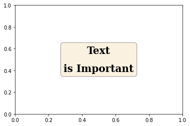
bbox
Text를 강조할 때 사용하며, bbox를 통해 background를 조정하는 게 더 편할 수 있다.
fig, ax = plt.subplots()
ax.set_xlim(0, 1)
ax.set_ylim(0, 1)

ax.text(x=0.5, y=0.5, s='Text\nis Important',
        fontsize=20,
        fontweight='bold',
        fontfamily='serif',
        color='black',
        linespacing=2,
        va='center', # top, bottom, center
        ha='center', # left, right, center
        rotation='horizontal', # vertical?
        bbox=dict(boxstyle='round', facecolor='wheat', alpha=0.4)
       )


plt.show()
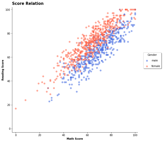
Text 적용 예시
Title와 Legend 추가하기
ax.set_title('Score Relation',
             loc='left', va='bottom',
             fontweight='bold', fontsize=15
            )

ax.legend(
    title='Gender',
    shadow=True,
    labelspacing=1.2,
    loc='lower right', # 범주의 대략적인 위치 지정
    bbox_to_anchor=[1.2, 0.5], # 범례 위치 지정
  	# ncols = 2 범례 안의 내용을 2열로 나타내기
)
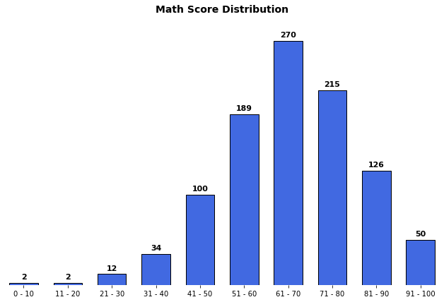
Bar Plot 위에 Text 추가하기
ax.set(frame_on=False) # Figure의 네 변을 없애기
ax.set_yticks([]) # y축 제거하기

for idx, val in math_grade.iteritems():
    ax.text(x=idx, y=val+3, s=val,
            va='bottom', ha='center',
            fontsize=11, fontweight='semibold'
           ) # Bar Plot 위에 직접 데이터 값 표시
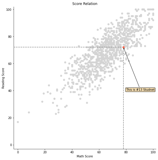
특정 마커를 가리키는 화살표와 평행선 그리기
fig = plt.figure(figsize=(9, 9))
ax = fig.add_subplot(111, aspect=1)

# 13번째 데이터 마커
i = 13

ax.scatter(x=student['math score'], y=student['reading score'],
           c='lightgray',
           alpha=0.9, zorder=5)

ax.scatter(x=student['math score'][i], y=student['reading score'][i],
           c='tomato',
           alpha=1, zorder=10)

ax.set_xlim(-3, 102)
ax.set_ylim(-3, 102)

ax.spines['top'].set_visible(False)
ax.spines['right'].set_visible(False)

ax.set_xlabel('Math Score')
ax.set_ylabel('Reading Score')

ax.set_title('Score Relation')

# x축과 평행한 선
ax.plot([-3, student['math score'][i]], [student['reading score'][i]]*2,
        color='gray', linestyle='--',
        zorder=8)

# y축과 평행한 선
ax.plot([student['math score'][i]]*2, [-3, student['reading score'][i]],
       color='gray', linestyle='--',
       zorder=8)

bbox = dict(boxstyle="round", fc='wheat', pad=0.2)
arrowprops = dict(
    arrowstyle="->")

ax.annotate(text=f'This is #{i} Studnet',
            xy=(student['math score'][i], student['reading score'][i]),
            xytext=[80, 40],
            bbox=bbox,
            arrowprops=arrowprops,
            zorder=9
           )

plt.show()
'Data Science > 데이터 시각화' 카테고리의 다른 글
| Matplotlib 모듈로 그린 Chart에서 Facet 사용하기 (0) | 2022.02.15 |
|---|---|
| Matplotlib 모듈로 그린 Chart에서 Color 사용하기 (0) | 2022.02.15 |
| Matplotlib의 Pyplot 모듈로 Scatter Plot 그리기 (0) | 2022.02.15 |
| Matplotlib의 Pyplot 모듈로 Line Plot 그리기 (0) | 2022.02.15 |
| Matplotlib의 Pyplot 모듈로 Bar Plot 그리기 (0) | 2022.02.15 |
Contents
소중한 공감 감사합니다.