Data Science/데이터 시각화
Matplotlib의 Pyplot 모듈로 Bar Plot 그리기
- -
2022년 2월 3일(목)부터 4일(금)까지 네이버 부스트캠프(boostcamp) AI Tech 강의를 들으면서 개인적으로 중요하다고 생각되거나 짚고 넘어가야 할 핵심 내용들만 간단하게 메모한 내용입니다. 틀리거나 설명이 부족한 내용이 있을 수 있으며, 이는 학습을 진행하면서 꾸준히 내용을 수정하거나 추가해 나갈 예정입니다.
Bar Plot
Bar Plot이란?
직사각형 막대를 사용하여 데이터의 값을 표현하는 차트이자 그래프이다.
막대 그래프, bar chart, bar graph 등의 이름으로도 사용된다.
범주(category)에 따른 수치 값을 비교하기에 적절한 방법이며, 개별 비교, 그룹 비교 모두 적합하다.
막대의 방향에 따른 분류
- 수직 (vetrical)
.bar()- $x$축에 범주, $y$축에 값을 표기 (default)
- 수평 (horizontal)
.barh()- $y$축에 범주, $x$축에 값을 표기
- 범주가 많을 때 적절하다.
다양한 Bar Plot
Multiple Bar Plot
Bar Plot에서는 범주에 대해 각 값을 표현해서 1개의 feature에 대해서만 보여준다.
여러 Group(Feature)을 보여주기 위해서는 다음과 같은 방법이 있다.
- 플롯을 여러 개 그리는 방법
- 한 개의 플롯에 동시에 나타내는 방법 (Good)
- 쌓아서 표현하는 방법
- 겹쳐서 표현하는 방법
- 이웃에 배치하여 표현하는 방법
Stacked Bar Plot
두 개 이상의 그룹을 쌓아서 표현하는 bar plot이며, 각 bar에서 나타나는 그룹의 순서는 항상 유지한다.
맨 밑의 bar 분포 또는 전체 총합에 대한 분포를 파악하기는 쉽지만 그 외의 분포들을 관찰이 어렵다는 단점이 있다. 이는 수치에 대한 주석을 직접 달아주는 방법으로 보완할 수 있다.
2개의 그룹이 서로 positive와 negative인 반대의 의미를 지니면 축을 조정할 수 있다.
.bar()에서는 bottom 파라미터를 사용한다.
.barh()에서는 left 파라미터를 사용한다.
Percentage Stacked Bar Chart
각각의 범주에 대해서 전체에 대한 비율을 표시하는 bar chart이다.
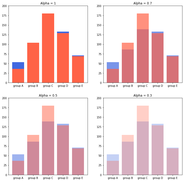
Overlapped Bar Plot
두 개 그룹만 비교한다면 겹쳐서 만드는 것도 선택지가 될 수 있다. 단, 3개 이상의 그룹일 때는 파악이 어려운 단점이 있다. 이때는 bar plot보다는 area plot이 더 효율적이다.
같은 축을 사용해서 비교가 쉬워진다.
alpha로 투명도를 조정하며, 실제 색상의 명도나 채도도 함께 고려해야 한다.
Grouped Bar Plot
그룹별 범주에 따른 bar를 이웃되게 배치하는 방법이며, 여러 group을 비교할 때 가장 추천되는 방법이다.
Matplotlib는 범주형보다는 수치형 데이터에 더 적합해서 다른 bar plot보다는 구현이 상대적으로 까다롭다.
Group이 5개~7개일 때 효과적이며, 그룹이 이보다 더 많으면 비율이 적은 그룹은 ETC로 처리할 수 있다.
Bar Plot 사용 시 유의점
지켜야 할 원칙: Principle of Portion Ink
실제 값과 그에 표현되는 그래픽으로 표현되는 잉크 양은 비례해야 한다!.
반드시 $x$축의 시작은 Zero(0)이어야 한다.
막대 그래프에만 한정되는 원칙이 아니라 Area Plot, Donut Chart 등 다수의 시각화에서도 적용된다.
데이터 정렬하기
더 정확한 정보를 전달하려면 정렬이 필수적이다. Pandas에서는 sort_values(), sort_index()를 사용하여 정렬한다.
데이터의 종류에 따라 정렬하는 기준을 다르게 해야 한다.
- 시계열: 시간순
- 수치형: 크기순
- 순서형: 범주의 순서대로
- 명목형: 범주의 값에 따라 정렬
한 가지 정렬이 정답이 아니므로 여러 가지 기준으로 정렬하여 패턴을 발견할 수 있어야 한다.
대시보드에서는 사용자의 요청에 따라 interactive하게 제공하는 것이 유용하다.
적절한 공간 활용
여백과 공간만 조정해도 가독성이 높아진다.
Matplotlib의 bar plot은 ax에 꽉 차게 그려져서 답답한 느낌을 줄 수 있다.
이를 해결하는 테크닉으로 다음과 같은 것들이 존재한다.
- X/Y axis Limit
.set_xlim(),.set_ylim()
- Spines
.spines[spine].set_visible()
- Gap
width
- Legend
.legend()- 범례의 위치를 어디에 두는가도 중요하다.
- Margins
.margins()- 양옆의 테두리를 조정할 수 있다.
복잡함과 단순함
필요없는 복잡함으로 화려하게 디자인할 필요가 없다. 무의미한 3D의 사용뿐만이 아니라 직사각형이 아닌 다른 형태의 bar 사용도 지양해야 한다.
무엇을 보고 싶은지, 시각화를 보는 대상이 누구인지를 고려해야 한다.
- 정확한 차이(EDA)를 보여줘야 하는 경우
- Grid(
.grid()) 격자로 데이터가 정확히 어떤 값인지 보조적으로 알려줄 수 있다. - Ticklabels(
.set_ticklabels())를 사용하여 필요한 값을 명시할 수 있다.
- Grid(
- 큰 틀에서 비교 및 추세 파악(Dashboard)을 위한 경우
- Grid를 빼고 필요한 정보를 최소화하는 게 중요하다.
오차 막대를 추가하여 Uncertainty 정보를 추가할 수 있다. (errorbar)
Bar 사이의 Gap을 0으로 하려면 히스토그램(Histogram)을 사용한다. .hist()를 사용하여 구현이 가능하며, 연속된 느낌을 줄 수 있다는 특징이 있다.
제목(.set_title()), 라벨(.set_xlabel(), .set_ylabel()) 등 다양한 text 정보를 활용할 수 있다.
Bar Plot 사용 예시
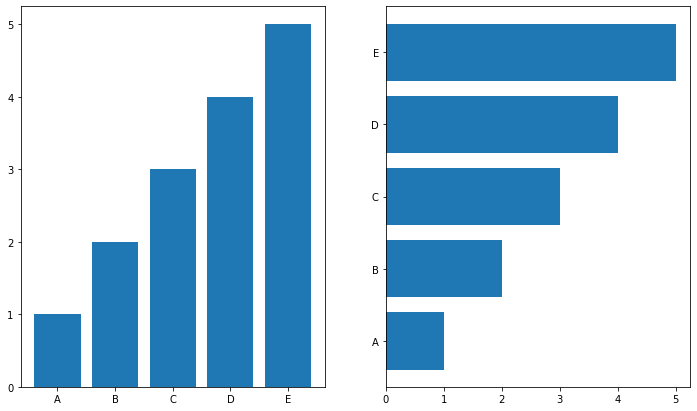
.bar()와 .barh()
fig, axes = plt.subplots(1, 2, figsize=(12, 7))

x = list('ABCDE')
y = np.array([1, 2, 3, 4, 5])

axes[0].bar(x, y)
axes[1].barh(x, y)

plt.show()
.sample()
.sample()은 데이터를 랜덤으로 추출하므로 전체 데이터의 분포를 파악하는 용도로서 .head()보다는 .sample()을 사용하는 것이 더 유용하다.
student = pd.read_csv('./StudentsPerformance.csv')
student.sample(5)
.info()
각 column마다 데이터의 null값이 얼마나 있는지, 데이터 타입은 무엇인지를 파악할 수 있다.
student.info()
.describe()
미리 데이터의 통계 정보를 살펴볼 수 있다.
student.describe(include='all')
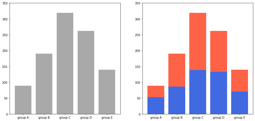
Multiple Bar Plot
matplotlib는 자동으로 여백의 크기를 맞춰줘서 수치의 스케일이 다를 수 있다.
fig, axes = plt.subplots(1, 2, figsize=(15, 7))
axes[0].bar(group['male'].index, group['male'], color='royalblue')
axes[1].bar(group['female'].index, group['female'], color='tomato')
plt.show()
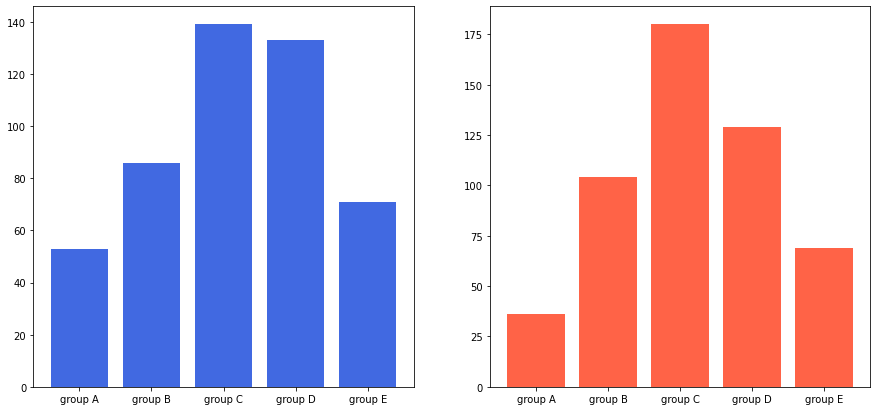
이를 해결하는 두 가지 방법
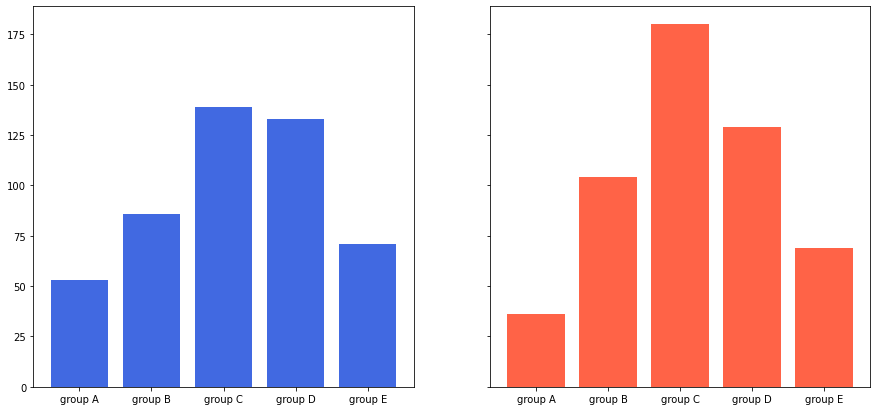
- 서브플롯을 만들 때 sharey 파라미터를 사용하는 방법
fig, axes = plt.subplots(1, 2, figsize=(15, 7), sharey=True)
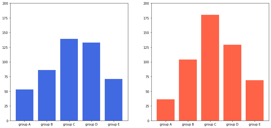
- y축 범위를 개별적으로 조정하는 방법
for ax in axes:
    ax.set_ylim(0, 200)
Stacked Bar Plot
여러 그룹을 순서대로 쌓아서 그룹에 대한 전체 비율을 알기 쉽다. bottom 파라미터를 사용해서 아래 공간을 비워둘 수 있다.
fig, axes = plt.subplots(1, 2, figsize=(15, 7))

group_cnt = student['race/ethnicity'].value_counts().sort_index()
axes[0].bar(group_cnt.index, group_cnt, color='darkgray')
axes[1].bar(group['male'].index, group['male'], color='royalblue')
axes[1].bar(group['female'].index, group['female'], bottom=group['male'], color='tomato')

for ax in axes:
    ax.set_ylim(0, 350)

plt.show()
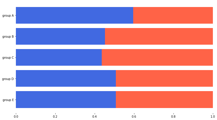
Percentage Stacked Bar Plot
group을 역순 정렬하지 않고 쌓으면 위에서 아래로 정렬되는 그룹 순서가 반대가 되므로 미리 정렬할 때 역순 정렬을 한다.
fig, ax = plt.subplots(1, 1, figsize=(12, 7))

group = group.sort_index(ascending=False) # 역순 정렬
total = group['male'] + group['female'] # 각 그룹별 합

ax.barh(group['male'].index, group['male']/total,
        color='royalblue')

ax.barh(group['female'].index, group['female']/total,
        left=group['male']/total,
        color='tomato')

ax.set_xlim(0, 1)

# 네 면의 모서리를 모두 안 보이게 한다.
for s in ['top', 'bottom', 'left', 'right']:
    ax.spines[s].set_visible(False)

plt.show()
Overlapped Bar Plot
group = group.sort_index() # 다시 정렬

fig, axes = plt.subplots(2, 2, figsize=(12, 12))
axes = axes.flatten()

# 투명도에 따라 bar plot이 어떻게 그려지는지 확인한다.
for idx, alpha in enumerate([1, 0.7, 0.5, 0.3]):
    axes[idx].bar(group['male'].index, group['male'],
                  color='royalblue',
                  alpha=alpha)
    axes[idx].bar(group['female'].index, group['female'],
                  color='tomato',
                  alpha=alpha)
    axes[idx].set_title(f'Alpha = {alpha}')

for ax in axes:
    ax.set_ylim(0, 200)


plt.show()
Grouped Bar Plot
$x$축의 각 값 별 여러 그룹(Feature)의 데이터를 인접하게 묶어서 bar plot을 그리고 싶을 때 유용하다.
다음과 같은 방법으로 grouped bar plot을 사용할 수 있다.
- $x$축 조정
- $x$축에서 약간 벗어나게 하려면 $x$값 자체를 조정해 줘야 한다.
width조정xticks,xticklabels
fig, ax = plt.subplots(1, 1, figsize=(12, 7))

# 각 group의 이름을 서수로 얻을 수 있어야 한다.
idx = np.arange(len(group['male'].index))
width=0.35

ax.bar(idx-width/2, group['male'],
       color='royalblue',
       width=width)

ax.bar(idx+width/2, group['female'],
       color='tomato',
       width=width)

ax.set_xticks(idx)
ax.set_xticklabels(group['male'].index)

plt.show()
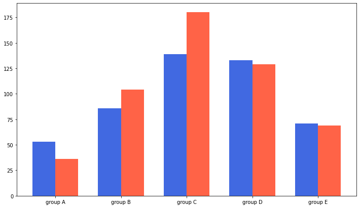
label과 legend를 통해 비교가 편한 범례를 추가할 수도 있다.
fig, ax = plt.subplots(1, 1, figsize=(12, 7))

idx = np.arange(len(group['male'].index))
width=0.35

ax.bar(idx-width/2, group['male'],
       color='royalblue',
       width=width, label='Male')

ax.bar(idx+width/2, group['female'],
       color='tomato',
       width=width, label='Female')

ax.set_xticks(idx)
ax.set_xticklabels(group['male'].index)
ax.legend()

plt.show()

index $i$(zero-index)에 대해서는 다음과 같이 x좌표를 계산할 수 있다.
$x + \frac{−𝑁 + 1 + 2 × 𝑖}{2} × 𝑤𝑖𝑑𝑡ℎ$
group = student.groupby('parental level of education')['race/ethnicity'].value_counts().sort_index()
group_list = sorted(student['race/ethnicity'].unique())
edu_lv = student['parental level of education'].unique()

fig, ax = plt.subplots(1, 1, figsize=(13, 7))

x = np.arange(len(group_list))
width = 0.12

for idx, g in enumerate(edu_lv):
    ax.bar(x+(-len(edu_lv)+1+2*idx)*width/2, group[g],
       width=width, label=g)

ax.set_xticks(x)
ax.set_xticklabels(group_list)
ax.legend()

plt.show()
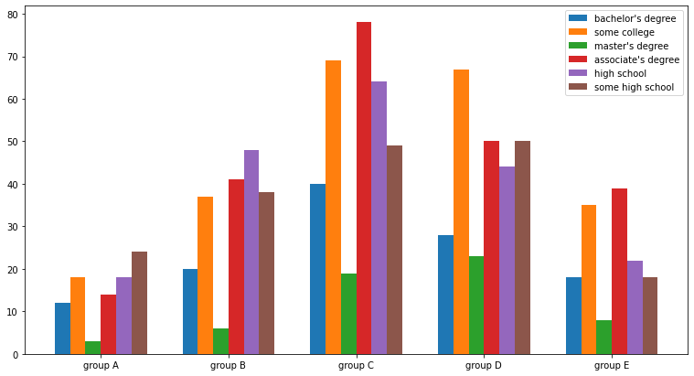
seaborn에서는 countplot을 통해 직접 $x$축의 위치를 지정할 필요 없이 좀 더 편하게 Grouped Bar plot 구현이 가능하다.
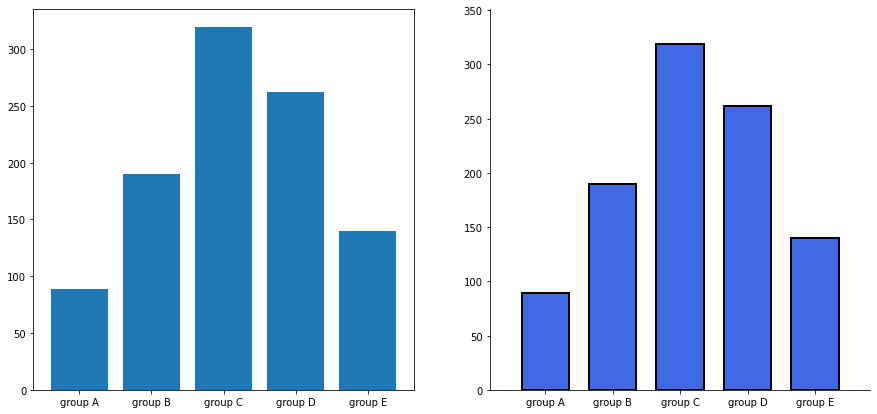
가독성 높게 바꾸기
group_cnt = student['race/ethnicity'].value_counts().sort_index()

fig = plt.figure(figsize=(15, 7))

ax_basic = fig.add_subplot(1, 2, 1)
ax = fig.add_subplot(1, 2, 2)

ax_basic.bar(group_cnt.index, group_cnt)
ax.bar(group_cnt.index, group_cnt,
       width=0.7,
       edgecolor='black',
       linewidth=2,
       color='royalblue'
      )

ax.margins(0.1, 0.1)

for s in ['top', 'right']:
    ax.spines[s].set_visible(False)

plt.show()
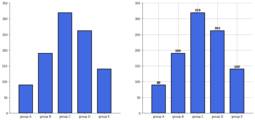
Grid와 Text 추가하기
가독성과 정확성을 고려하여 Grid 또는 실제 수치에 대한 Text를 추가할 수 있다.
group_cnt = student['race/ethnicity'].value_counts().sort_index()

fig, axes = plt.subplots(1, 2, figsize=(15, 7))

for ax in axes:
    ax.bar(group_cnt.index, group_cnt,
           width=0.7,
           edgecolor='black',
           linewidth=2,
           color='royalblue',
           zorder=10
          )

    ax.margins(0.1, 0.1)

    for s in ['top', 'right']:
        ax.spines[s].set_visible(False)

axes[1].grid(zorder=0)

for idx, value in zip(group_cnt.index, group_cnt):
    axes[1].text(idx, value+5, s=value,
                 ha='center',
                 fontweight='bold'
                )

plt.show()
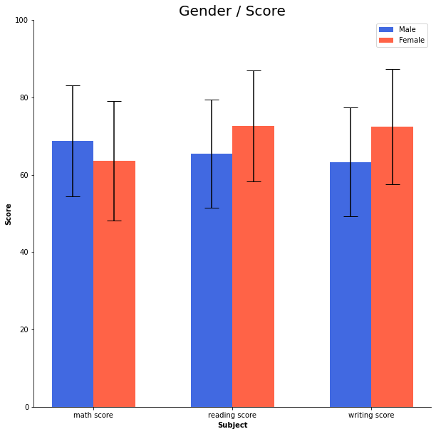
오차막대(errorbar) 추가하기
yerr 파라미터를 전달하여 오차막대를 추가할 수 있다.
capsize로 위아래의 수직선의 크기를 조정할 수 있다.
score_var = student.groupby('gender').std().T

fig, ax = plt.subplots(1, 1, figsize=(10, 10))

idx = np.arange(len(score.index))
width=0.3


ax.bar(idx-width/2, score['male'],
       color='royalblue',
       width=width,
       label='Male',
       yerr=score_var['male'],
       capsize=10
      )

ax.bar(idx+width/2, score['female'],
       color='tomato',
       width=width,
       label='Female',
       yerr=score_var['female'],
       capsize=10
      )

ax.set_xticks(idx)
ax.set_xticklabels(score.index)
ax.set_ylim(0, 100)
ax.spines['top'].set_visible(False)
ax.spines['right'].set_visible(False)

ax.legend()
ax.set_title('Gender / Score', fontsize=20)
ax.set_xlabel('Subject', fontweight='bold')
ax.set_ylabel('Score', fontweight='bold')

plt.show()
'Data Science > 데이터 시각화' 카테고리의 다른 글
| Matplotlib 모듈로 그린 Chart에서 Text 사용하기 (0) | 2022.02.15 |
|---|---|
| Matplotlib의 Pyplot 모듈로 Scatter Plot 그리기 (0) | 2022.02.15 |
| Matplotlib의 Pyplot 모듈로 Line Plot 그리기 (0) | 2022.02.15 |
| Python과 Matplotlib (0) | 2022.02.15 |
| Data Visualization - 데이터 시각화와 데이터 시각화의 요소 (0) | 2022.02.15 |
Contents
소중한 공감 감사합니다.